Summary
This page demonstrates all the typography and content styles available in the site, including headings, text formatting, code blocks, blockquotes, layout shortcodes, and academic-focused shortcodes for publications, abbreviations, and styled content blocks.
Typography Samples
Headings Hierarchy
Heading 1 (H1)
Display-level heading for major sections
Heading 2 (H2)
Primary section heading with accent color
Heading 3 (H3)
Secondary section heading with accent color
Heading 4 (H4)
Tertiary section heading
Heading 5 (H5)
Quaternary section heading
Heading 6 (H6)
Smallest heading level (uppercase)
Text Formatting
This is a regular paragraph with bold text and italicized text. You can also combine them with bold italic text.
Here’s another paragraph to show spacing. Regular body text uses the type-body-large size with wide letter spacing for optimal readability.
Markdown Attributes
Hugo supports markdown attributes on block-level elements. Add attributes using {.class} or {style="..."} syntax after the block.
This entire paragraph has the small class applied for smaller text.
This paragraph has custom inline styling with accent color and bold weight.
You can also combine classes and styles:
This paragraph demonstrates combined attributes with small text, italic style, and muted color.
Section Headers
Use the .section-head class on headings to create styled section dividers:
Research Highlights
This creates a centered, styled heading suitable for major section breaks.
Usage:
My Section Title
{.section-head}
Lists
Unordered List
- First item in the list
- Second item with more content
- Nested item one
- Nested item two
- Third item
Ordered List
- First numbered item
- Second numbered item
- Nested numbered item
- Another nested item
- Third numbered item
Code Examples
Inline Code
Use the console.log() function to print output in JavaScript. The className prop in React accepts a string.
Code Block
function fibonacci(n) {
  if (n <= 1) return n;
  return fibonacci(n - 1) + fibonacci(n - 2);
}

// Calculate the 10th Fibonacci number
const result = fibonacci(10);
console.log(result); // Output: 55
def quicksort(arr):
    if len(arr) <= 1:
        return arr
    pivot = arr[len(arr) // 2]
    left = [x for x in arr if x < pivot]
    middle = [x for x in arr if x == pivot]
    right = [x for x in arr if x > pivot]
    return quicksort(left) + middle + quicksort(right)
Blockquotes
This is a blockquote. It has a left border in the accent color and italic text.
Blockquotes can span multiple paragraphs and are perfect for highlighting important information or quotes from other sources.
Note: You can also include bold text and italic text within blockquotes.
Links
This is a paragraph with an inline link to demonstrate link styling. Links have the accent color and underline on hover.
Horizontal Rules
Horizontal rules (shown above and below) create visual separation between sections.
Special Layout Shortcodes
Summary Block (Centered, Narrower)
The summary block at the top of this page is an example of centered, constrained content (720px max-width).
Usage:
{{< summary >}}
### Summary
This is summary content that will be centered and have a narrower width.
{{< /summary >}}
Banner and Callout
Two simple emphasis containers for markdown content:
Usage:
{{< banner >}}
Announcement text with **markdown** support.
{{< /banner >}}

{{< callout >}}
Note text with **markdown** support.
{{< /callout >}}
Two-Column Layout (Even Split)
Column One
- Great for balanced text, lists, embeds, or callouts
- Automatically collapses to a single column on smaller screens
Column Two
Add any markdown content you need; each column block is rendered with standard article typography.
Usage:
{{< columns >}}
  {{< column >}}
  Left column content
  {{< /column >}}
  {{< column >}}
  Right column content
  {{< /column >}}
{{< /columns >}}
Two-Column Layout (Custom Split)
Left Column
- Perfect for balanced text or list content
- Honors custom split ratios for flexible layouts
Right Column
Use this when you need two text blocks side-by-side with a custom ratio. The split argument accepts colon-separated fractions (e.g., 1:2, 2:3, 3:1).
Usage:
{{< columns split="1:2" >}}
  {{< column >}}
  Left column content
  {{< /column >}}
  {{< column >}}
  Right column content
  {{< /column >}}
{{< /columns >}}
Available split ratios:
1:1(default) - Equal columns1:2/2:1- Third vs two-thirds layouts1:3/3:1- Quarter vs three-quarters- Any custom sequence like
2:3,3:5, or even1:1:1for three equal columns (add an extracolumnblock for each value)
Cloudflare Stream Embed
Use the cloudflare-stream shortcode to embed responsive Cloudflare Stream videos with optional autoplay, looping, mute, custom posters, or generated thumbnails.
Usage:
{{< cloudflare-stream
  video_id="your-video-id"
  customer_id="your-customer-id"
  autoplay=true
  loop=true
  muted=true
  poster="https://example.com/poster.jpg"
  poster_time="10s"
  poster_height="480"
  startTime="30"
>}}
A direct poster URL takes priority. If you leave it out but provide both poster_time and poster_height, the shortcode will build a Cloudflare thumbnail using those values. Use startTime (or start_time) to begin playback at a specific offset in seconds.
Media Cards and Grid
Poster cards linking to the standalone player pages, arranged in a responsive grid — the same components the videos gallery uses. Full reference in docs/media-cards.md.
 2:24
LPAC: Learnable Perception-Action-Communication Loops
2:24
LPAC: Learnable Perception-Action-Communication Loops
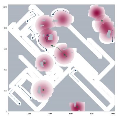 0:36
Exploration and Exploitation in Coverage Control
0:36
Exploration and Exploitation in Coverage Control
 manual
A manual card: any link, any poster
manual
A manual card: any link, any posterUsage:
{{< media-grid >}}
{{< media-card video_key="lpac-tro-mp4" >}}
{{< media-card video_key="coverage-control-explore-exploit-mp4" poster_time="10s" >}}
{{< media-card href="/page/" title="Manual card" poster="https://…" badge="manual" >}}
{{< /media-grid >}}
With video_key, the poster, title, duration badge, and link are derived from data/cloudflare_stream_metadata.yaml; any explicit argument overrides the derived value. poster_time picks the thumbnail frame (a poster_time field on the registry entry does the same for every appearance of that video). Without a key, pass href (required), title, poster, and badge yourself.
With embed="true" the card hosts a live Stream player instead of a linked poster — like the home-page embeds, at card size:
Usage:
{{< media-grid >}}
{{< media-card video_key="lpac-exp-feb-9r2e-mp4" embed="true" autoplay="true" loop="true" startTime="2s" >}}
{{< media-card video_key="coverage-control-explore-exploit-mp4" embed="true" autoplay="true" loop="true" >}}
{{< /media-grid >}}
Embed cards accept the playback arguments of the cloudflare-stream shortcode (autoplay, loop, muted, controls, startTime, letterboxColor, poster/poster_time). Autoplay implies muted. The player letterboxes transparently inside the standard card frame, so static and embed cards align in the same grid.
Academic & Research Shortcodes
Abbreviations
The abbrvs shortcode automatically wraps abbreviations with tooltips. Terms are defined in data/abbrvs.yaml.
Example: Machine learning uses gnns and cnns for various tasks.
Usage:
{{< abbrvs "gnn" >}}  <!-- Looks up "gnn" in abbrvs.yaml -->
{{< abbrvs "cnn" >}}  <!-- Looks up "cnn" in abbrvs.yaml -->
To add new abbreviations, edit data/abbrvs.yaml:
gnn:
  term: gnn
  title: Graph Neural Network
Abstracts and other processed text also get abbreviations applied automatically (via the apply-abbr partial), so defined terms gain tooltips without any shortcode.
Accent Text (sa shortcode)
The sa shortcode wraps text in an accent-colored strong tag, useful for highlighting key terms.
Example: This text is accented and stands out in the paragraph.
Usage:
{{< sa "research interests" >}}
Accent Block (sa-block shortcode)
The sa-block shortcode creates a titled block with accent-colored heading and markdown content.
Example Block:
This is the content of the block. It supports markdown formatting and can include lists, links, and other elements.
Usage:
{{< sa-block "Title:" >}}
Block content with markdown support
{{< /sa-block >}}

{{< sa-block "Title:" markdown="false" >}}
Plain text content without markdown processing
{{< /sa-block >}}
Publication Reference
The pubref shortcode renders a full publication citation with authors, venue, and links. Publications are defined in the cv submodule (submodules/cv/data/): conferences.yaml, journals.yaml, preprints.yaml, and thesis.yaml.
Usage:
{{< pubref "agarwal-2025-lpac" >}}
Optional arguments: add_links="false" hides the publication links, pdf_only="true" shows only the PDF link.
The shortcode automatically:
- Looks up the publication across all data sources
- Formats authors with the primary author highlighted
- Resolves venue information from
venues.yaml - Displays links and optional abstract in an expandable section
Publications List
The publications shortcode displays all publications from a specific data source, sorted by date.
Usage:
{{< publications source="conferences" >}}
{{< publications source="journals" >}}
{{< publications source="preprints" >}}
Publications are automatically sorted by year and month. Configure sorting in config/_default/hugo.toml:
[params.publications]
  primaryAuthorID = "agarwal-s"
  sortLatestFirst = true
Profile
The profile shortcode renders a profile section using configuration from the site’s config/<site>/hugo.toml.
Usage:
{{< profile >}}
Configuration is in config/<site>/hugo.toml. The photo is served from Cloudflare Images via profile_image_id with a responsive srcset:
[params]
  author = "Your Name"
  role = "Your Role"
  affiliation = "Your Organization"
  contact = "email [at] domain [dot] edu"
  profile_image_id = "cloudflare-images-id"

[params.cloudflare_images]
  account_hash = "your-account-hash"
Members / People
The members shortcode renders a group roster from a data file, grouped into the
sections declared under categories (only non-empty sections appear). Every
member gets the same card in a responsive grid. Photos come from Cloudflare
Images via each member’s image_id, falling back to initials on an accent
gradient.
Usage:
{{< members >}}                    <!-- reads data/members.yaml -->
{{< members data="members_demo" >}} <!-- reads data/members_demo.yaml -->
Links are typed, and each type supplies its own icon and label:
links:
  - type: email        # url may be a bare address; mailto: is added for you
    url: [email protected]
  - type: website      # website · linkedin · github · scholar · orcid · cv
    url: https://example.com
  - type: cv
    url: /files/grace-cv.pdf
    label: CV (PDF)    # optional override of the default label
The demo dataset below (no photos, so every card shows initials):
PhD Students
Undergraduate Researchers
A single member, written as content
Someone whose entry needs more room than a roster tile — the PI, typically — is
written straight into the content file with the member shortcode. The entire
card body is the inner content: ordinary markdown, your line breaks, your
wording, your order, other shortcodes included. Only the photo, the heading and
the link row are arguments. Rendering still goes through the same card partial
as the roster above, so styling stays in one place.
Attach a class where you want the card’s colours, with
Goldmark block attributes
({.class} on the line after a block), which are enabled site-wide:
member-card__role- accent-coloured, for the title/department lines
accent- accent-coloured, for any other line — office, email, anything else
Usage:
{{< member
  title="Principal Investigator"
  name="Ada Researcher"
  image_id="…"
  website="#"  scholar="#"  cv="#"
>}}
Assistant Professor
Mechanical Engineering
Indian Institute of Technology (IIT) Bombay
{.member-card__role}

Office: S01-A
Email: [[email protected]](mailto:[email protected])
{.accent}

Then the bio, in as many paragraphs as you like.
{{< /member >}}
Two trailing spaces at the end of a line give you the hard line break, as
anywhere else in markdown. layout="lead" (the default) is the wide card;
layout="card" gives the grid-sized one.
name is optional too. Leave it out and the card renders no heading, so the
name can go in the body as a ## — or anything else — and be styled like the
rest of what you wrote:
{{< member title="Principal Investigator" image_id="…" >}}
## {{< sa "Ada Researcher" >}}
Assistant Professor
{.member-card__role}
{{< /member >}}
The photo’s alt text comes from name, so without it the photo is marked
decorative — which is right when the name is in the body a line below it.
Principal Investigator
Ada Researcher
Assistant Professor
Mechanical Engineering
Indian Institute of Technology (IIT) Bombay
Office: Room 101
Email: [email protected]
Everything above and below is plain markdown typed in the content file — emphasis, links, and gnns via other shortcodes all work, and the line breaks are yours.
Nothing here is a fixed field, so this block can say whatever a given person needs it to say.
Combined Example
Here’s a more realistic example combining multiple styles and shortcodes:
Research Methodology
Our approach consists of three main phases:
- gnns for multi-agent communication
- cnns for perception
- mlps for action selection
- Data Collection: Gather sensor readings from distributed robot agents
- IMU measurements at 100Hz
- LiDAR scans at 10Hz
- Camera frames at 30Hz
- Processing Pipeline: Real-time analysis using the following algorithm:
def process_sensor_data(readings):
    filtered = kalman_filter(readings)
    features = extract_features(filtered)
    return classify(features)
- Coordination: Agents communicate via the LPAC protocol
“The key insight is that local perception can inform global coordination through efficient message passing.” — Research Team Lead
Results show a 94.7% success rate in collaborative tasks with sub-second latency.
Math
MathJax is enabled site-wide (math = true in config/_default/hugo.toml). Use $$ … $$ or \[ … \] for display math and \( … \) for inline math.
Inline: the coverage cost is \( \mathcal{J}(\mathbf{p}) \) for robot positions \( \mathbf{p} \).
Display:
$$ \mathcal{J}(\mathbf{p}) = \sum_{i=1}^{N} \int_{V_i} \| \mathbf{q} - \mathbf{p}_i \|^2 \, \phi(\mathbf{q}) \, d\mathbf{q} $$Usage:
Inline: \( \mathcal{J}(\mathbf{p}) \)

$$
\mathcal{J}(\mathbf{p}) = \sum_{i=1}^{N} \int_{V_i} \| \mathbf{q} - \mathbf{p}_i \|^2 \, \phi(\mathbf{q}) \, d\mathbf{q}
$$
Images and Figures
Raster Images (Cloudflare Images)
The cloudflare-images shortcode serves photos and screenshots from Cloudflare Images with an automatic responsive srcset:
Usage:
{{< cloudflare-images
  image_id="96b88196-c6c8-4f02-ddc7-da6484e87c00"
  srcset_widths="600,1200,1800"
  alt="Line coverage visualization"
  quality="85"
>}}
Required: image_id, srcset_widths, alt. Optional transform args (quality, format, fit, gravity, …) apply to every generated variant; sizes is auto-generated if omitted.
SVG Figures
The svg shortcode renders vector figures with an optional caption (markdown supported):

Usage:
{{< svg
  src="/images/diagram.svg"
  alt="System architecture"
  width="1200"
  height="800"
  max-width="1200px"
  caption="Optional caption with **markdown** support"
>}}
width/height are the figure’s intrinsic dimensions (only the ratio matters); they let the browser reserve space before the file loads, avoiding layout shift. Omitting them logs a build warning.
Conclusion
This showcase demonstrates the complete typography and shortcode system available in the site. The system combines:
- Typography: Material Design typography tokens with Catppuccin colors (light and dark themes)
- Layout Shortcodes: Flexible column layouts, summary blocks, media cards, and video embeds
- Academic Shortcodes: Publication management, abbreviations, and styled content blocks
- Data-Driven Content: Publications, authors, venues, videos, and abbreviations managed through YAML files
All shortcodes support markdown content and can be combined to create rich, interactive academic content.